Business cards may seem a strange subject to be talking about on a copywriting and marketing blog. After all, can a copywriter help with the creation of business cards?
Well the answer is yes – in a way they can.
It is not very often that the humble business card gets to fulfil its potential. Seen by many as a simple means of leaving their contact details with someone, the business card is in fact a mini marketing tool. A fact that is usually overlooked.
Its layout, contents, strapline and use of space is very important in creating something that is eye-catching and memorable. After all, how many times have you been to a networking event only to return home with a fist full of cards that all look the same? Usually they are plain white with a bit of text on showing a name and contact details. They are instantly forgettable and, sadly, so are the people who they belonged to.
If you want to be remembered, make a mark with your business card.
There are two sides to every story
There are also two sides to every business card. So why do so many people forget to use the space on the back of their cards?
Use it to show the services you offer, your USP, even images of your product.

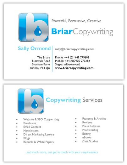
Above is my business card. As you can see I have used both sides of the card to show not only my contact details but also the services I offer to my clients. That way I avoid the conversation that goes…
“Oh, I didn’t realise you did that as well. If I’d known I would have called you.”
The reverse side of your card can be used for many purposes:
- List of services (as above)
- Images of your products
- Your USP
- An offer
- Your picture
- Testimonials
I’m sure you can probably think of a few more.
Make an impact
As you can see from the above, my business card is fairly plain. But its white background sets off my blue logo and works well.
But business cards don’t have to be white. Utilising colour is another way of generating interest and getting your card (and you) remembered. Whether you go for something soothing and pastle or bold and vibrant, the colours you use can say a lot about your business.
For example, if you are a young and funky design agency, your business card will need to reflect that with bold colours and vivid text or graphics.
The market you are aiming for will be reflected in your colour pallett – heritage colours (burgandy, dark green etc.) for the more serious professions (e.g. Solicitors, Accountants etc.), bright and vibrant colours for ‘cool’ businesses (e.g. Design agencies, IT etc.). Of course that’s not set in stone, I’m sure there are many trendy accountants out there who would benefit from a bright, eye-catching business card design too.
Don’t be square
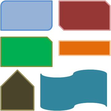
People often seem to believe that business cards have to be rectangular. That’s not so.
Just because most cards are that shape (yes, including mine), doesn’t mean that’s the way they have to be. Stand out from the crowd by using different dimensions or shapes:

Using a shape that is slightly out of the ordinary is a great way to draw attention to yourself. And, when an unusual shape is coupled with a strong colour, the impact is increased.
Interactive cards
What do I mean by interactive? Well, your business card could fold into an card that stands up. Perhaps it can be folded into a box shape. Maybe it has a slit in it to hold something – the pizza restaurant Zizzi is very good at that. Your bill arrives slotted into a business card.
This makes your card stand out from the crowd and gets you noticed.
So you can see there are lots of ways you can use colour, shape and clever functions to get your card and you noticed.
Where does the freelance copywriter come into all of this?
Well, we may not be designers, but we are very good at coming up with straplines and succinct ways of putting your marketing message across.
This post was inspired by an entry I found on dailyblogggr.com. Here are the 36 brilliant examples of business card designs they identfied. It’s amazing the impact such a small piece of card can have – they really can be a very powerful tool in your marketing armoury.


1 comment so far ↓
I just ordered my first set of business cards ever. Wish I’d read your article first–I left one side blank. Darn! Oh well, next time.
Leave a Comment