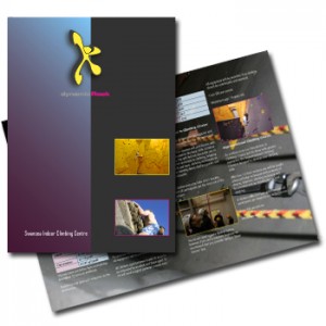
With more and more companies turning to online marketing and advertising, is there still a place for the humble brochure within your marketing armoury?
Local search and SEO are huge today and many businesses are (quite rightly) investing heavily in these areas. After all, more and more people are turning to the internet when looking for products and services. Plus, with 85% of all search traffic clicking on organic listings rather than the sponsored links (PPC), it’s not surprising that this is where the focus on online marketing is these days.
So has the company brochure really been consigned to the rubbish bin once and for all?
Let me leave this with you
However much I hate it, face to face networking is here to stay. Nothing can replace meeting someone in ‘the flesh’ and connecting with them on a personal level. Personally I am not a fan of networking as I’m the type of person who is terrified of being in a room of strangers. Walking up to a group and breaking into a conversation is harder for me than undergoing root canal surgery.
But it is something I force myself to do every once in a while.
When you are in that situation, having a brochure often has more impact that handing over a business card. There’s a lot more room to get your message across for a start. But that doesn’t mean you should fill it with boring, pretentious nonsense that’s going to turn the reader off.
Think brochure, think web copy
I’ve often written about the importance of getting your website copy right.
You have to grab their attention with a great headline, sell the benefits immediately, talk to them and then tell them what to do. Compiling your brochure should take the same approach.
It should make the reader sit up and think ‘Wow! These guys are great. I must phone them immediately.” OK, a bit cheesy but you get the picture.
Your brochure should:
Look great
That doesn’t mean it has to be bold and colourful. Some of the best brochures I’ve seen have been very simple. Whatever look you go for, make sure it fits with your brand and company image. Try to make it fresh, eye-catching – something that’s tactile that they’ll want to pick up and read.
Talk the talk
Just like your website, never, ever begin your brochure…”We’ve been in business for 40 years and pride our selves on…”
Who cares?! Certainly not your reader.
Think benefits, think offer, and think like your customer:
- Tell them what you’re going to do for them
- Sell them the benefits of your business
- Tell them why your products or services are the perfect fit
A brochure isn’t your soap box from which you can shout about your achievements. It’s your website in their hand. It’s a piece of marketing that they can keep with them and refer to whenever they need to.
Tell them what to do next
All too often a great brochure is spoilt by one omission – a call to action.
Your brochure is designed to be taken away which is why it’s even more important than ever to have a compelling call to action within it. There can be several – one after each section if you like. The main thing is when your reader has absorbed its contents, they know exactly what to do – call you, email you or visit you.
Why you need to know this
With today’s online world people are forgetting traditional off line marketing tools. A brochure may not seem technologically advanced, but there is still a place for them for many businesses.
However it’s important to make them fresh, compelling and different. If you want to stand out from your competitors you’re going to have to get creative.
Sally Ormond – freelance copywriter


1 comment so far ↓
I’m glad I came across this article. I’ve been debating about whether or not to add a brochure to my marketing tools. It sounds like it might be a good idea, even though I make most of my contacts online. And what the heck, it’ll give me something to write on the slow days!
Leave a Comment