The following guest post was written by Dr Simon Raybould. The author’s views are entirely his own and may not reflect the views of FreelanceCopywritersBlog.com. If you are interested in producing a Guest Post for this blog, please get in touch with your ideas.
I’m a good writer – that is, I put a good choice of words in a good order. The result is something that says what I mean and means what I say.
Well, I like to think so. Other people might disagree.
As Coleridge once said (allegedly) “Prose, words in their best order. Poetry, the best words in the best order.” Which makes copywriting a form of poetry, I suppose. Perhaps we could define copywriting as ‘The best words in the best order to sell’. How does that sound?
If that’s the case, then I’d define presentations as the best words in the best order to explain and/or inform.
Now, as any professional presenter or presentation skills trainer will tell you, one of the best ways to get your message across in a presentation is not to use words at all – well, not lots of words on a screen, at least. Stories you tell out loud aren’t what I’m thinking of here.
I’m thinking of the dreaded screen full of crap.
The bullet point deluge that carries enough ordnance to supply Camp Bastion for a week.
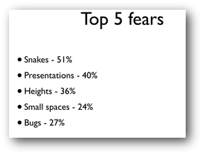
We know that slides with images and very view words work best (and by ‘we’ I mean those people who research into how to make good presentations and who teach people how to make good presentations!). The research evidence is that slides like this don’t work…
…when compared to slides like this…
Notice the lack of words?
Obviously, it’s not possible to get away with having no words on your slides all the time, so it becomes a question of what I pretend is the ultimate copywriting challenge – getting just one or two words to capture everything you want to say.
There are few fixed rules about how to do this, but I offer the following guide-lines, based upon experience of professionally appraising thousands of bad presentations (oh, God, the pain! Those are hours of my life I can never get back!).
Sentences are a mistake in slides (unless you’re quoting someone like Einstein, in which case have the courtesy to quote him in full). This is because a sentence takes too much processing. Phrases are better. Now obviously I’m over simplifying here, because a sentence can have just one word in it: “Run!” is a perfectly formed sentence, but you know what I mean.
A full sentence is a closed concept – it doesn’t pro-actively engage a member of the audience who reads it on your slides because all the work has been done for them by you. You can absorb sentences passively. Presentations are not books – or pamphlets or whatever…
Phrases are better. Grammar be damned – it’s all about effect, not keeping your company’s grammar police happy (hello Clare! I love you really.). “Ensure you have an uptake level above the required thresholds” is dull, closed sentence, compared to “Uptake targets”.
Besides, it takes a lot less time to read just two words – which means your audience’s attention will be pulled back to you (and you’re interesting, remember!) in much less time.
Passivity is a mistake (in slides, at least). Okay, to be completely honest, if you have so few words that you’re down to single words or pairs of words (a verb and an adjective) such as “Work harder”, then it’s hard to worry about whether your words are in the active or the passive voice… but if you’ve got a choice, the active voice is better.
Let’s fact it, who wants to “Receive instructions” when they can “Grab the facts”?
Finally…
Explanations are a mistake. What I mean by this is that if you’ve got to explain what you mean, what you’re writing is too complicated (for a slide). See what I’ve done there?
To be really effective, your slides should engage your audience immediately. Audiences don’t like working hard to understand slides: they don’t mind working hard to understand your message, of course (sometimes) but the slides themselves need to be simple so that the audience can grab ‘em immediately.
An analogy I used for my second book was ‘like a brick wrapped in velvet’. The message – your brick – can be as hard hitting and difficult as you like but you need to wrap it in something that audiences can get hold of easily – such as velvet – if you want them to pick up your brick.
(Yes, yes, it’s a rubbish analogy but I was a young man when I wrote that book!)
In short, you should never need to say something twice, in a different way. If you do, your original explanation wasn’t clear enough.
In other words, you shouldn’t need to do what I’ve just done!
Author’s bio:
Dr Simon Raybould is one of the UK’s foremost presentation skills trainers (see http://www.curved-vision.co.uk to see how he and his company can help you). He’s also a professional speaker in the area of resilience, emotional robustness, confidence and happiness. (See http://www.divventpanic.info).
He lives in Newcastle, with his wife and two children (when they want something) and is a reasonably proficient fire-eater!


0 comments ↓
There are no comments yet...Kick things off by filling out the form below.
Leave a Comment