Entries Tagged 'effective copy' ↓
December 5th, 2012 — copywriter, copywriting tips, effective copy, Home Page, website copywriter, website copywriting
The art of website copywriting is a complex one.
Many website’s that have been written in-house tend to make the same mistake.
No, we’re not talking about bad grammar or blaring typos (although that may be true in some cases), the problem is with the actual content itself.
You see, although your website exists to bring your company to the attention of your market place, it isn’t there to shout about you.
Confused?
Think about it this way. Imagine you’re out looking for a new pair of shoes. As you walk down the High Street you spot a gorgeous looking shop with oodles of ‘must have’ shoes in the window.
Its upmarket feel and the immaculately displayed shoes, boost and sandals seduce you. Before you know it you’ve walked through the door and an assistant is approaching you.
You expect them to greet you, ask how you are and what you’re looking for – are you looking for shoes for a special occasion….really, a Ball? How wonderful, what’s your dress like? You know, niceties like that.
But what they actually do is tell you all about the company, how long they’ve been trading, what car the MD drives and how they believe they are the most unique shoe retailer in the country.
I don’t know about you, but I would be out of there faster than a fast thing.
The same thing goes for your website.
Your Home Page is likely to be the page that most visitors arrive at, so it’s the first impression they’ll get of your company. But rather than reading about how amazing your company is, it needs to be focused 100% on the needs of your customers.
Why should they buy from you?
No, not because you’ve been in business since 1889….They should buy from you because you offer unique shoes, shoes that will make them feel special, shoes that people will stop and stare at, shows that will show the world how successful they are, shoes that will make people stop and stare wishing they could be just like them.
OK, a bit OTT, but you get the picture.
The copywriting on your home page must be all about the benefits your customers will enjoy if they buy your product (or service). It must communicate to your reader that you’re a company that puts its customers first.
Over to you
Take a look at your Home Page – who is the main focus on, you or your customers?
If it’s you, it’s time to change your copy – if you need a hand, get in touch with a professional copywriter and get your copy working for you.
November 30th, 2012 — conversion, copywriting tips, effective copy, website copywriter, website copywriting
As yet another year draws to a close, isn’t it about time you gave your website a quick review to make sure its ready for the New Year?
There are many great sites out there that are bursting with powerful and persuasive web copy, eye-catching images and uber-friendly navigation. But on the flip side, there are that have useless content, dire navigation and as for the images…
What follows are 8 quick tips to help you make your website a nicer place to be for your visitors. They have been compiled from my pet hates and the things that I see done badly time and time again.
1. About Us
Copywriters around the world speak with one voice when they tell clients that their web copy has to be written for their readers. That means no ‘we’ and lots of ‘you’ and benefits.
A lot of business owners have a real problem with that because they just want to shout about their company and what they’ve achieved. Well, to cheer you all up, the About page is the one on which you can talk about yourself – kind of.
Your About page should tell you readers what makes you different to everyone else, your ethos, why you do what you do and also some personal information about you (to show that you’re human) and your team along with a few mug shots (to prove you’re real).
It shouldn’t just start ‘We’ve been in business since 2001 and are the best thing since sliced bread…’
2. We’re here
If you want people to do business with you, why are you making it so hard for them to find you?
Make sure you provide your physical address and a Google map so they can find you. Plus, pictures of your premises are a great idea so they recognise it when they arrive.
3. Hanging on the telephone
How many times have you been on a website only to get thoroughly frustrated when you can’t find a phone number?
Make it easy for your customers and potential customers to get in touch with you. Have your phone number clearly visible in the top left hand corner of your header.
4. Banish typos
Proofreading is sooooo important. Typos could well put people off getting in touch with you so make sure, before you publish any content on your site, that you get it proofed by someone.
5. Rules
This one is for all you site owners out there with customer logins. Now, the Internet is a wonderful thing as it means you can get all your Christmas shopping done without having to fight your way through town.
The downside is most sites want you to create an account in order to shop with them (or use their service). If you’re site is one of these and you have rules about how many letters passwords should have and whether they have to be a mixture of numbers and letters, please, please, please tell the user before they think of something.
There’s nothing more annoying than having come up with a password only to be told it’s not long enough or doesn’t contain the right combination of characters.
So if you must have rules, make them known.
6. Mobile
More and more people are using their mobile devices to access the Internet. In fact, mobile devices account for over 20% of all traffic to e-commerce sites and 1 in 3 mobile users access the Internet through their phones.
That’s why it’s so important your website is mobile friendly. After all, if they try to access your site and it’s slow or unreadable, they’re going to head off in search of another site that’s easier to use.
7. Social
Yes, social media is taking over the world. Unless you want to be left behind, you must make sure your site is social.
Offering customers the ability to share your stuff with their friends is vital to spread the word. Twitter, Facebook and other social sites mean customers can talk to you easily and help promote your amazing service (it is amazing, right?) by telling their friends.
It’s here to stay so get with it.
8. Fabulous photos
How many websites have you seen with woeful photography or stacks of stock images?
Come on people be a bit more inventive. Don’t be tight, splash out and get some decent shots taken of your premises, stock, people etc. Make the images on your website unique.
Right, that’s your homework for December – check your website and make sure it’s firing on all cylinders for the New Year.
September 17th, 2012 — copywriter, copywriting tips, effective copy
A short while ago I was approached by Joseph Bushnell of Web Marketing Inner Circle, to do an interview about my work as a copywriter.
During the interview Joseph wanted to dig down to find our exactly what it is that makes writing persuasive, powerful and have the ability to sell more. But not only that, he also explored life as a copywriter and what that role involves.
Here are a few of the areas we covered areas such as:
- How to make your web copy more powerful, creative and persuasive
- The essential rule to follow when writing for your own business
- 1 word which you should avoid using in copywriting at all costs (and what word you should use instead)
- 3 tips for making your copy more readable
- How to find out what your customers truly value the most
- Whether you should you focus on one main benefit or multiple benefits?
- How to stop yourself from overwriting
- How to get testimonials that are so strong, they lead to new customers
- 6 ways to get social proof
- 5 newsworthy reasons to publish a press release
- How to create a newsletter that your readers will value (and buy from)
- Whether to use plain text or HTML in your newletters?
- Why you need “thick skin” as a copywriter
- When it might be appropriate to walk away from a copywriting project
You can listen to the interview by clicking on the button below. This will take you to Joseph’s site, to listen click on my mug shot at the bottom of the page.

September 12th, 2012 — copywriting tips, effective copy
What is the one thing that will get your website visitors buying?
No, I’m not talking about your services or products (although they do help), what I mean are the words on your site.
Pretty images and a flashy high-tech website will only go so far; if the words on your website, or more importantly the way they appear, aren’t clear no one will hang around to buy.
In the past I’ve looked at the importance of your website copy and why it should be full of benefits rather than features, but this post is more concerned with a different aspect of copywriting: the physical writing itself.
Get your message read
In a simple world, someone lands on your website, reads your text, thinks ‘that’s for me’ and buys.
Well, the world isn’t simple and that’s not how it works.
There are several barriers that could stand between you and securing a buying visitor. And I’m not talking about cost or anything like that (although valid barriers), what I mean is the text on your site.
Font size
If someone lands on your site and sees teeny tiny text that they can’t read even with their face presses up against their screen, they’re no going to buy.
But if they’re greeted by a font size that is clear and highly readable, they will continue along the sales process.
Font colour
Black text on a white background is probably the best combination you can have.
White text on a black background isn’t too bad, but can be tricky for some.
But very pale colours on a white background or dark colours on a dark background will be a complete turn off as your reader will have to go and lie down in a darkened room to recover from eye strain.
So think carefully before you decide on your design theme.
Type of font
Your choice of font will also have an impact on the impression you’ll give your visitors.
Most companies opt for something like this font; it’s simple, easy to read and looks professional.
But please, please, please avoid the dreaded Comic Sans font, you may think it shows your playful side, but it doesn’t. It’s just very annoying and makes you look like a. …[you can fill in the blank].
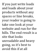
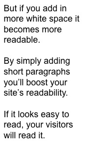
Spacing
The way you lay out your text is also important.


So you see, there’s a lot to think about even before you actually get down to the nuts and bolts of what you’re going to write about.
If you, at all times, have your reader in the forefront of your mind, you won’t go far wrong. Make sure:
• Your text is the right size
• Think carefully about colours and contrasts
• Choose your font wisely
• Keep lots of white space on your page.
April 25th, 2012 — effective copy, keywords, search engine optimisation, seo, SEO copywriter, seo website copywriter
Keyword density is one of those phrases from the past that should be buried.
In the bad old days of SEO (search engine optimisation), it was thought to be the best on-screen method of boosting your search rankings.
The problem behind this thinking was that if you had 10 instances of your keyword or phrase on your web page, but a competitor had 15, they would rank higher than you.
Can you see where this is going?
That’s right – the end result was a list of search results that took you to unreadable, unimaginative and very uninteresting content.
SEO the right way
Thankfully, most SEO copywriters today understand the value of natural copy that is written for the reader and not the search engines.
You see, if you write in a natural style about a particular subject, the keywords will appear and at a level that you would expect. The result is great information that is easy to read and that will help your on-screen SEO strategy.
If you think this is all stuff and nonsense and that having a certain percentage of keywords is still the way to go, have a read of this from Google’s very own Matt Cutts (speaking at SXSW earlier this year):
“What about the people optimizing really hard and doing a lot of SEO. We don’t normally pre-announce changes but there is something we are working in the last few months and hope to release it in the next months or few weeks. We are trying to level the playing field a bit. All those people doing, for lack of a better word, over optimization or overly SEO – versus those making great content and great site. We are trying to make GoogleBot smarter, make our relevance better, and we are also looking for those who abuse it, like too many keywords on a page, or exchange way too many links or go well beyond what you normally expect. We have several engineers on my team working on this right now.”
Be natural
So there you go, if you continue to over stuff your content with keywords it will damage your website in the long run as well as having an immediate effect on your conversion rate.
Good SEO copy is:
- Natural
- Written for your reader
- Simple to understand
- Well laid out
It really is as easy as that.


