Entries from July 2011 ↓
July 6th, 2011 — copywriting tips, marketing, online marketing, website copywriter, website copywriting, website design
 That might sound like a strange question to ask.
But think about it for a second – why do you have a website?
If your immediate answer is ‘because everyone else has one’ you’re barking up the wrong tree.
Yes, if you’re in business today you are expected to have a web presence but that shouldn’t be the sole reason for your website to exist.
Your website has to do something for you and, more importantly, something for your customers. Let me explain.
Your website and you
By having an effective presence on the web you will be able to:
Free up manpower because your website should answer most of your customers’ questions
- Be a source of information 24/7
- Help people find you on the internet
- Publicise events and your latest news
- Showcase you products and services
- Take orders online
And that’s just for starters.
But it’s not just about that. Yes, all of those things will make your life easier and, to a certain extent, your customers’ lives. But your website isn’t just there to help you.
Your website and them
Who is ‘them’?
They are your customers. Your website is a 24 hour a day, 7 days a week interface between you and your customers. As such it must speak to them directly, address their needs and show them what you can do for them.
When they land on your website they want:
Great service
You see, for your customers the most important thing is what you’re going to do for them so first impressions are vital.
First impressions count
Whether you already have a website or are in the early stages of development, here are a few pointers to bear in mind when thinking about its design:
- Does it reflect you and your values?
- Can your customer tell what you do from the design/layout?
- Are your contact details easy to find?
- Does your website reflect your brand values?
- Does the copy talk to your reader?
- Is it selling you or the benefits of your service?
- Is it social?
When someone first lands on your website they should be able to instantly see what you do. Your website copy should be benefits led and your site navigation should be easy to use.
Also, make sure your contact details are prominent – after all, your customer is going to want to know that they can get hold of you if they need to. But you also need to consider social media. If it’s right for your business you must use social media – customers expect it. Make sure they can easily interact with you via Twitter and Facebook as well as via the telephone and email.
If you still think a website is just an online brochure, think again. Today your website must work for you. It has to show you are a progressive company that has embraced social media to open up the lines of communication with your customers.
It should be your primary marketing tool so make the most of it.
July 4th, 2011 — blogging for business, copywriting, copywriting tips, freelance copywriter, freelance copywriting

Wow!
That just about sums up my reaction when I read an email I received from Boostcrt.com.
They recently compiled a list of the best copywriting blogs on the internet and, you guessed it, they included mine in the list.
I am truly honoured to be included especially as I’m nestling along copywriting greats such as Copyblogger, Michel Fortin, Bob Bly and Jeff Sexton (to name but a few).
You can take a look at the list here – Best Copywriting Blogs – The Definitive List fo Great Blogs for Marking Copywriters and Content Developers
Thanks guys and I shall wear my badge with pride.
Sally
Freelance Copywriter – Briar Copywriting
July 1st, 2011 — briefing a copywriter, brochure copy, brochure copywriting
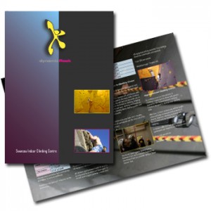
 Doesn’t it look great?
It took months to put it together but there it is in all its glory. Your new, shiny, gorgeous corporate brochure is ready to be distributed.
Are you pleased with it?
Hmm…if you’re that pleased there may be a problem – let me tell you why.
Giving in to temptation
Everyone does it now and then but temptation has its place and there is no room for it in your brochure.
Often, when you start to think about the content for your corporate brochure you:
- Talk about you
- You give your opinions on you
- You talk about what you want to achieve
Boring.
Don’t get me wrong. What you do is incredibly valuable but people (i.e. Joe Public) aren’t interested in what you think about your self, they are interested in themselves.
Doing it right
With the economy being what it is at the moment, the fact that you’re investing in a glossy, expensive corporate brochure tells the market (and all your competitors) that you’re doing well; you have a motivated and engaged team who are working their butts off to make you look great.
Fantastic – by why do all of this?
Well, a good brochure will help you:
- Gain investor confidence
- Attract new clients
- Show existing clients what you can do for them
- Impress the great and the good
But the problem is that there aren’t that many companies out there who do it right.
There’s no escaping the fact that you need a large team to pull off a cracking end result – designers, photographers, a great brochure copywriter. These guys are all experienced in what they do and can easily collaborate to achieve the ultimate end result.
However the main problem lies within your company. Although one person is assigned the headache of pulling the expert team together, the review stage is usually done by many people (CEOs, Directors etc.) which means there are too many opinions flying around the room.
Your brochure should not contain any corporate speak – in fact your expert copywriter would have gone to great pains to ensure the language is simple, accessible to all, clear and powerful which is not an easy thing to pull off. And yet by the time the copy has gone round everyone it’s mutated into an overly intellectual hotchpotch of meaningless drivel.
The design has been mauled mutating the understated, tasteful design into something way too ostentatious. And the wonderful photography of your staff and company has been replaced by dodgy stock images.
Why?
If you call in a group of experts to create your corporate brochure let them get on with it – they know what they are doing.
The perfect formula
Your corporate brochure has to be something people will want to pick up and read. If they don’t it becomes an extremely expensive coaster.
Use it wisely and make sure yours includes:
- A personal letter written by your Chairman or CEO
- Photos of your staff (be proud of them and show them off)
- Testimonials from customers
- Engaging case studies to show how you have helped clients overcome typical challenges
- A profile of your organisation
- Benefits driven copy to show how you can help your customers
- High level product descriptions and images
- Full and correct contact details
To make sure yours is done right make sure you start the process of with a plan. Decide amongst yourselves what you want to achieve, how you want it to look and how you want it to sound.
Then provide your expert team with a detailed brief for each element – design, photography and copywriting.
After that, sit back and let them get on with it.
Setting out your vision at the outset will ensure your get the result you were looking for.
Time to have your say
I’ve spouted on long enough, now I want to hear from you.
What, in your opinion, makes a good brochure?
 That might sound like a strange question to ask.
 Doesn’t it look great?


